As our Media site has continued to evolve, we’ve been continually reviewing our users’ needs to try to understand what they are looking for at any given moment. This has helped us improve contextual emphasis on the information we provide around the site, such as:
- Using HTTPS geolocation to serve nearby recommendations
- Automating content curation based on factors like the season
- Showing event information at the right time
…and much, much more! We’ve applied much of this same thinking with the re-design of our prefecture pages, and will continue to do so looking ahead.
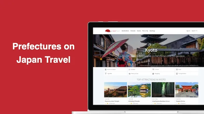
Prefectures v2.0
With Prefectures, we reset our approach and tried to provide an experience that ticks all the boxes for every user persona we identified through extensive user research.
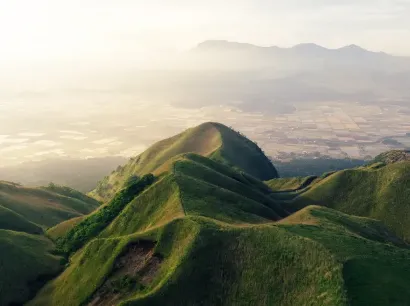
Inspiring views of little-known locations
Even though we run a popular Japan inbound travel site, we’ve never been really sure what to put at the top of the fold around the site. Do people want maps, hints of what to do, prices and actual things to buy?
We implemented Hotjar, a great tool that allows us to build up heatmaps of what real visitors do on the site. From this we learned that first time visitors very visually inclined and are stimulated by simple calls to action. As a result, we implemented a fluid full-width header that provides a powerful glimpse into each of Japan’s 47 prefectures, supported by light contextual and useful information — such as real-time weather.
Early results from Hotjar suggest that this combination of image and lightweight function is producing much better clickthroughs and continued navigation of places that initially have been well outside a first-time visitor’s field of interest.
Letting the content do the talking
User interviews have consistently told us that discovering cool things to do and finding unique recommendations is a top priority — so we wanted to put these front and centre.
This kind of info also puts the prefecture in the best possible light, because our readers get to see the really unique things that distinguish them from each other.
Seasonal specials
Our Things to Do area also prioritises content based on the time of year, so you’ll see suggestions related to the current season. Further down, we also serve upcoming event content towards the top of the page, as we know an increasing proportion of our users are visiting Japan and using (and relying on) the site in-country.
Promoting regions
The strength of many of Japan’s prefectures often comes down to their regional destinations: think Tochigi’s Nikko for its Shinto shrines, Kanagawa’s Hakone for its hot springs and lakeside views, or Hokkaido’s Niseko for winter sport enthusiasts. These are the places that people remember.
Traditionally, we’ve not always done the best job at highlighting this kind of regional information to our visitors, so we’ve decided to put greater emphasis on such popular tourist areas — early feedback tells us what we have is making a big difference, but we have a lot more planned too.
Welcoming first-time visitors
Whilst our team is located in Tokyo, our audience is predominantly overseas which constantly reminds us that our target user will know much less about Japan than ourselves living here. From this perspective, we knew that providing some contextual, factual information about each prefecture was an essential step to making new visitors feel welcome and help them trust the information they saw on the page.
We decided to keep this overall section in the main template sidebar so as to complement the main content — familiar patterns we know our readers are already used to from Google (Knowledge Graph) or Wikipedia.
However, we modified the mobile behaviour to ensure this supporting information did not distract or compete with the main recommendations that our users also wanted to see.
We also added a visual map to educate those users less familiar with Japan’s geography. Curious types will find its dual-purpose ability to quickly navigate around Japan an added bonus — anecdotal evidence suggests this is already a much-loved feature.
Meet the community
We have always known our community members enjoy being in the spotlight, with users directly telling us having their name around the site was a big motivating factor.
We wanted to go one step further than bylines though, and provide a glimpse into who the Local Experts were in each prefecture.
Our tests showed this kind of info can be really helpful to our users, including those looking for more relevant, local content and also those people just wishing to ask a few travel-related questions to the right person.
Above all, it reinforces the value proposition of our site and provides a reminder about the strength of our community and the backbone to our site.
Responsive on the go
Mobile is one of the biggest trends for the modern web, and one of the biggest growth areas for our site too.
Our mobile-first approach helped ensure our new design looks good on any device, in any orientation.
Portable devices will see supporting information about each prefecture slide in from off the canvas, allowing us to keep the main column as simple and clean as possible.
Thanks for reading, 
Putting Prefectures on the Map